Role: UX Research,U Design, UI design, Interaction design
Duration: 7 weeks, Mar - May 2022
Tools: Figma, Miro, Coreldraw
Project Overview:
This website redesign is for AM realty is a Nigerian Real estate startup that makes Real estate investments simple and accessible to more people by lowering the barrier to entry for Real estate investment.
6 people were recruited for this study and were given basic tasks to carry out on the old website. These tasks were hard for the users as more often than not they abandoned them due to frustration.
%201.png)
I identified the following flaws with the website from a heuristic evaluation.
Poor market advantage:
A business’ website main aim is to bring it to the doorstep of its (potential) customers and generate leads. This was not achieved on the website.
Poor visual design:
An overall user experience is improved by good user interface design. This website had a lot of inconsistencies in the alignment, layout and typography.
Difficult to understand and navigate:
Users were unable to locate information they needed on this website, such as the firm's services, detailed information on the property they were interested in e.t.c.
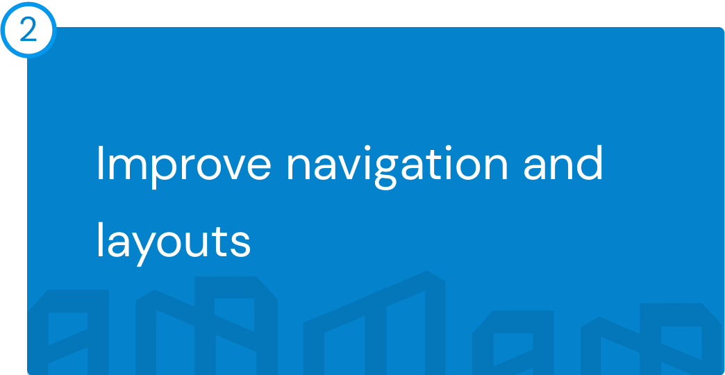
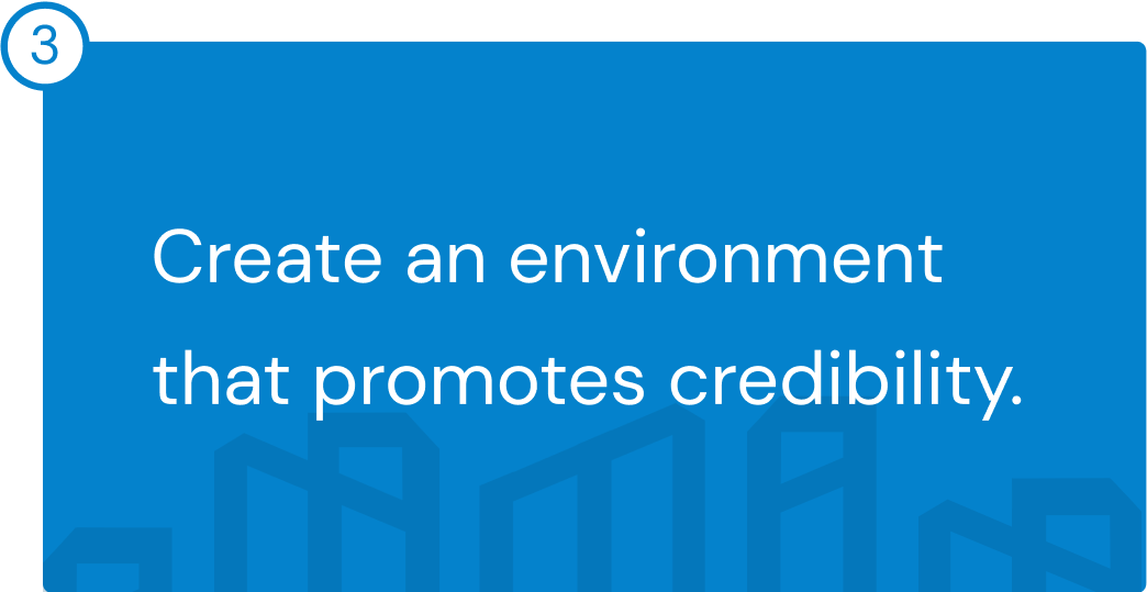
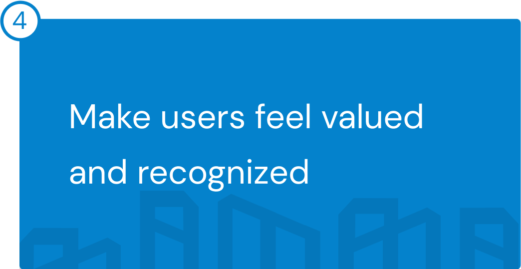
The key themes listed below served as a basis for my design.

I sent out a preliminary survey to learn more about property owners and what they look for when looking for a home to buy, a. The findings are shown below.
Insight:
Many of our respondents want to buy a home but aren't ready yet. I then knew I needed to find people who were ready to buy a property.
%201.png)
I conducted interviews with 8 participants who were interested in acquiring a property to collect detailed qualitative comments on how they go about doing so.
Insight:
I discovered that the majority of our participants were cautious about buying a home on the internet and that many websites make it difficult for customers to obtain information that might lead to sales.
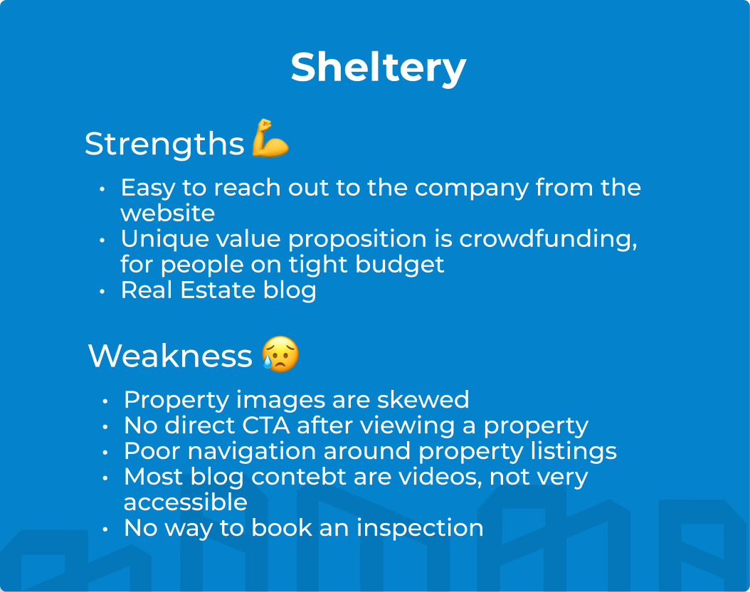
The audit was run on two businesses namely:
Sheltery (Direct competitor)
A Real Estate startup and brokerage firm involved in Real Estate investment.
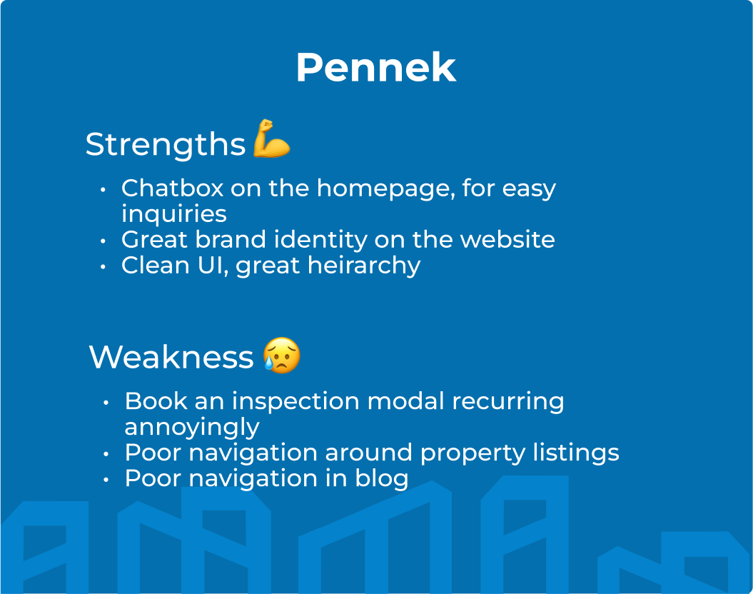
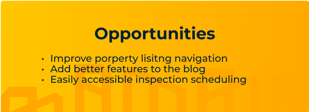
Pennek (Indirect competitor)
A large Real Estate company that provides solution to the procurement and provision of premium land and housing investment opportunities in Nigeria.
Key findings are shown below;
Balancing user needs with business goals:
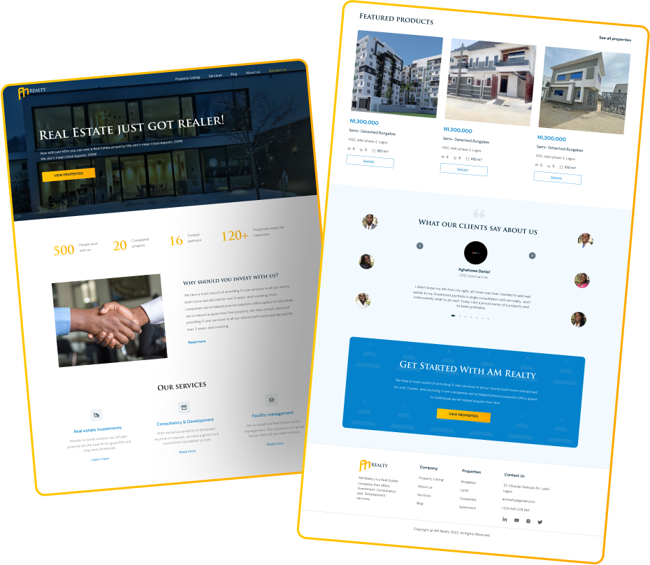
Merging the business and design goals required me to focus on a few key areas, such as streamlining the user experience across the landing page, displaying the services rendered and property listings at a glance, and thus meeting business and user goals such as key engagement, access to information, user retention, and sales, with an emphasis on credibility and functionality.
After working on the site map in a way to facilitate users in finding and processing the information they want I proceeded to create the wireframes for the website first before moving on to the mobile
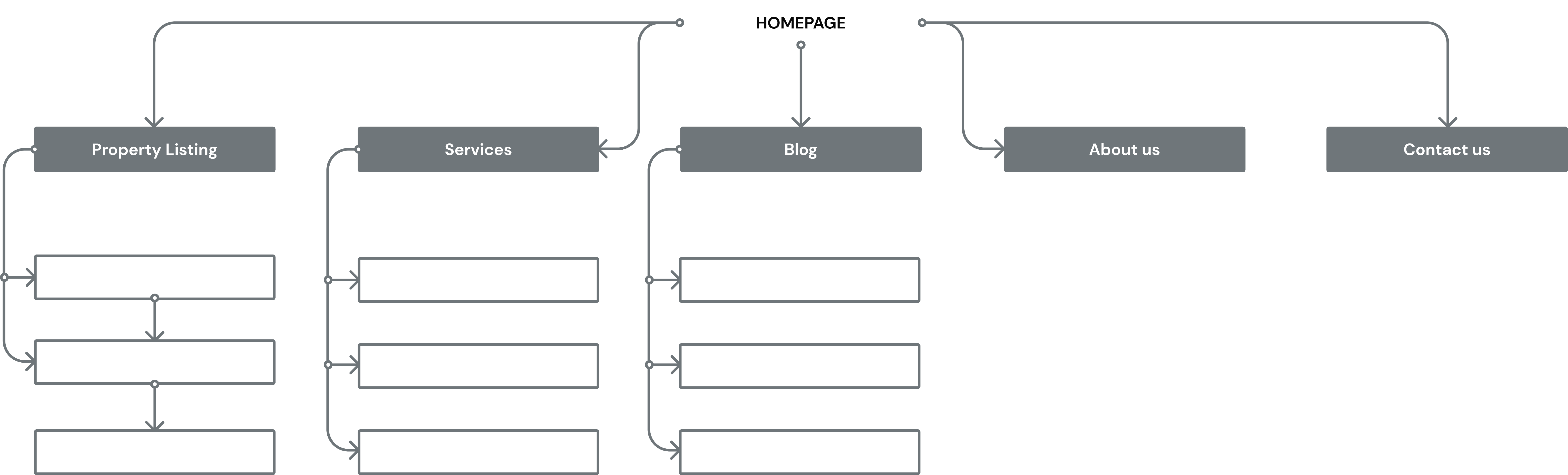
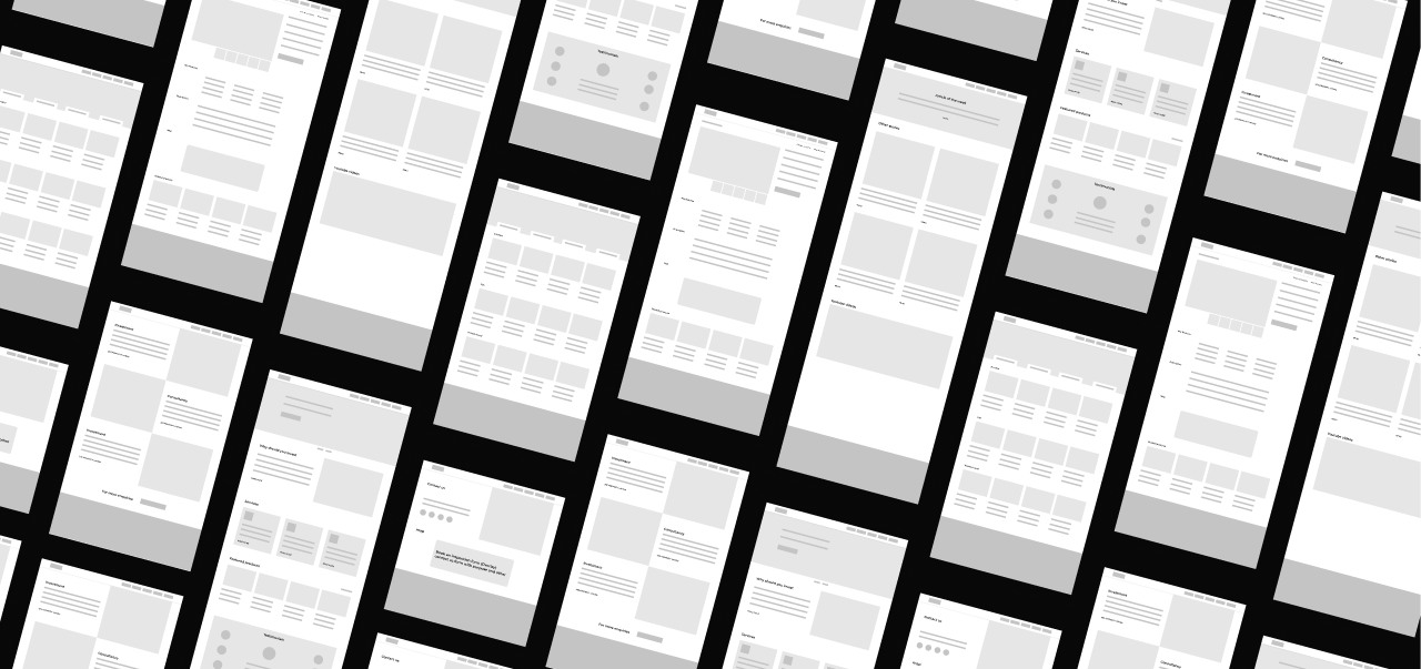

After working on the site map in a way to facilitate users in finding and processing the information they want I proceeded to create the wireframes for the website first before moving on to the mobile
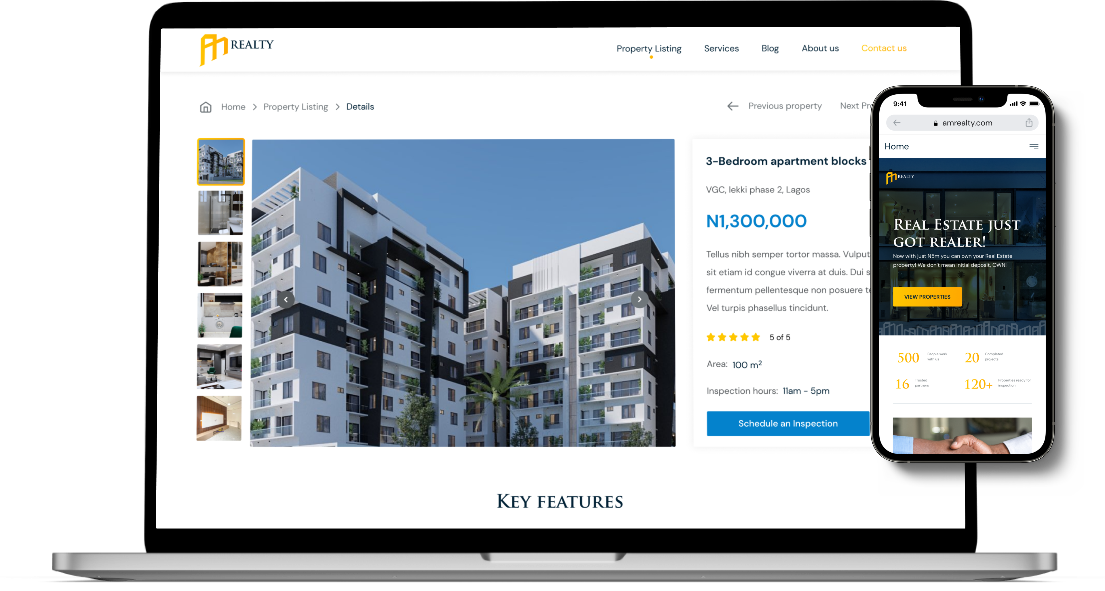
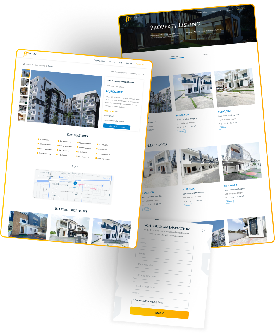
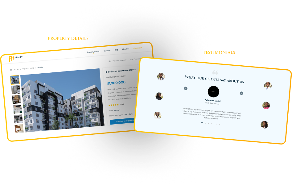
Property listing:
From the competitive audit, the opportunities for improvement identified were explored.
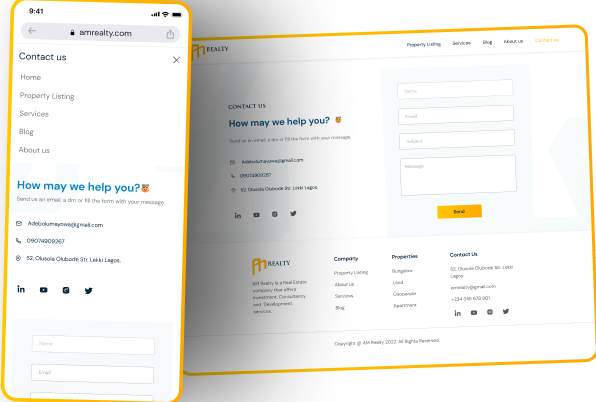
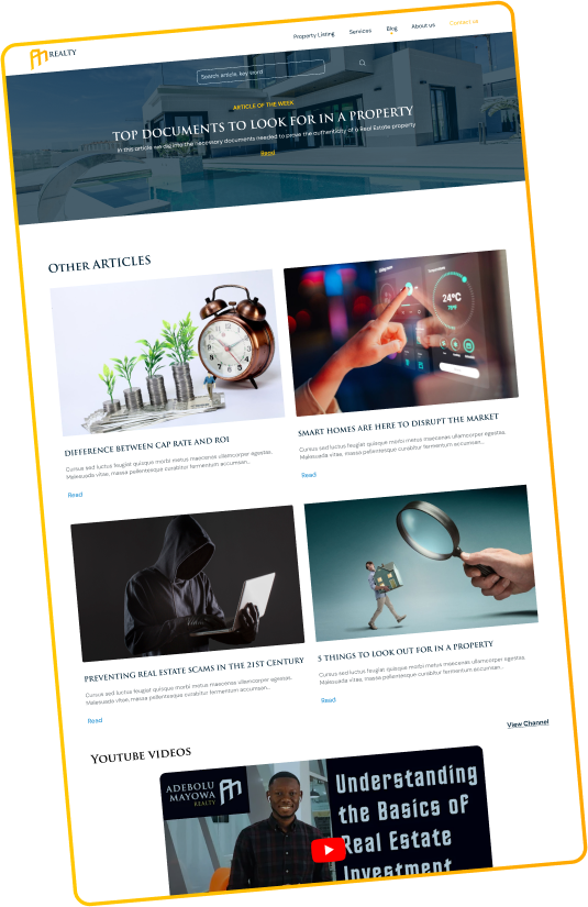
Blog:
The blog has a search for users to find articles they want through keywords. And a main article every week is displayed at the top of the blog, these features were inspired by the competitive audit findings.
I designed and prototyped the interactions for this two sections. The thought process behind this was to better organize content, and make browsing for properties/ reading reviews more seamless and engaging.
The ways to browse the content is either through the time delay, clicking the pictures or using the next\previous icon.

The purpose of this project was to improve the current website to one that’ll serve both the customers and business needs satisfactorily and I believe this was achieved.
The website is in development and I am working closely with the devs to ensure its built to standard.
Challenges:
In future projects I hope to learn more about interaction design, UX writing, Information architecture and Customer experience.